
Explore this page
The project may be a restrained company name, a collection of service messages, a promotional display, or a decorative treatment for interior glass. Each needs a different balance of coverage and open space. We start by asking what the windows should do for your business and what should remain visible through them. That gives the design a clearer purpose than simply covering the largest available area. The finished graphics should make sense from the customer's approach and feel connected to the activity inside, not compete with it.
Read the entire frontage before designing individual panes
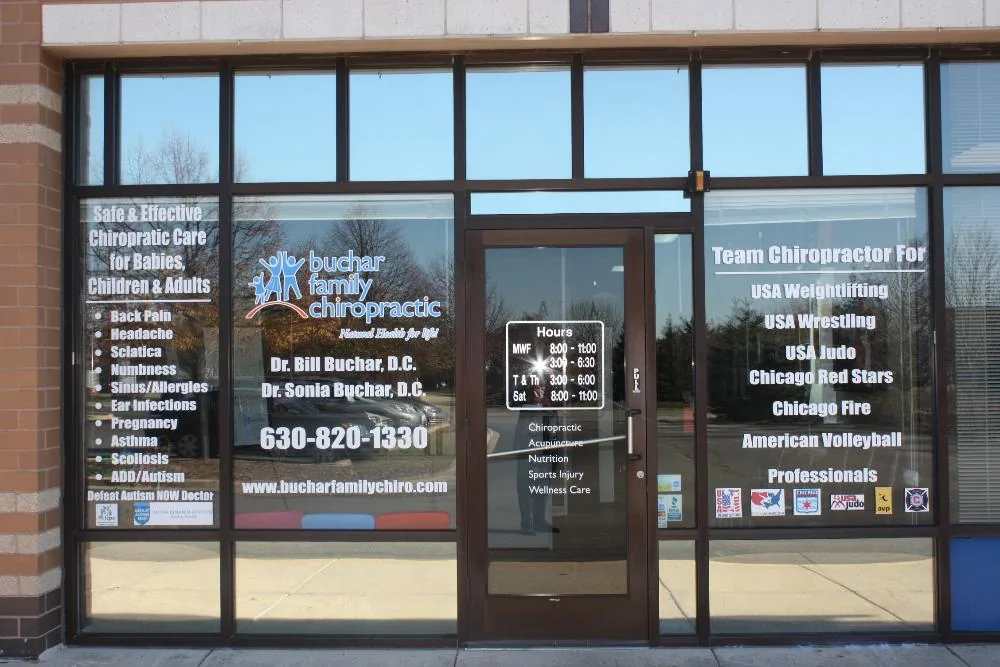
A row of windows is one composition, even when it is divided by frames and doors. Look at the whole elevation before assigning separate messages to each pane. A logo split awkwardly by a mullion can become harder to recognize. A promotion positioned beside the wrong door can direct attention away from the entrance. Photographs showing the complete frontage help reveal these relationships.
We discuss which glass areas belong to permanent identity and which can change with campaigns. Check what is visible from the sidewalk, parking area, and approach to the door. The customer may first see the windows from an angle rather than straight ahead. Existing signs above the unit should also be considered. Our storefront signs service can coordinate the main business identification, while the window design provides information appropriate to a closer view. Treating those surfaces together helps the frontage feel organized rather than assembled from unrelated messages.
Keep open views where they help the business
Coverage changes the relationship between the exterior and interior. A café may want people to see the seating and atmosphere. A showroom may prefer a clear view of selected displays. An office may want a more screened treatment around particular areas. Those needs should guide the layout before materials are chosen. There is no single percentage of coverage that makes sense for every commercial window.
Walk through the interior as well as looking from outside. Notice where daylight enters and which views matter to staff or customers. A graphic that looks balanced on the street may feel intrusive from a desk beside the glass. Discuss any visibility or property requirements that apply to the location. We help compare approaches around those practical priorities. The objective is not to maximize the printable area; it is to use the right portions of the glass so the message and the business environment support each other.
Choose the material around the intended effect
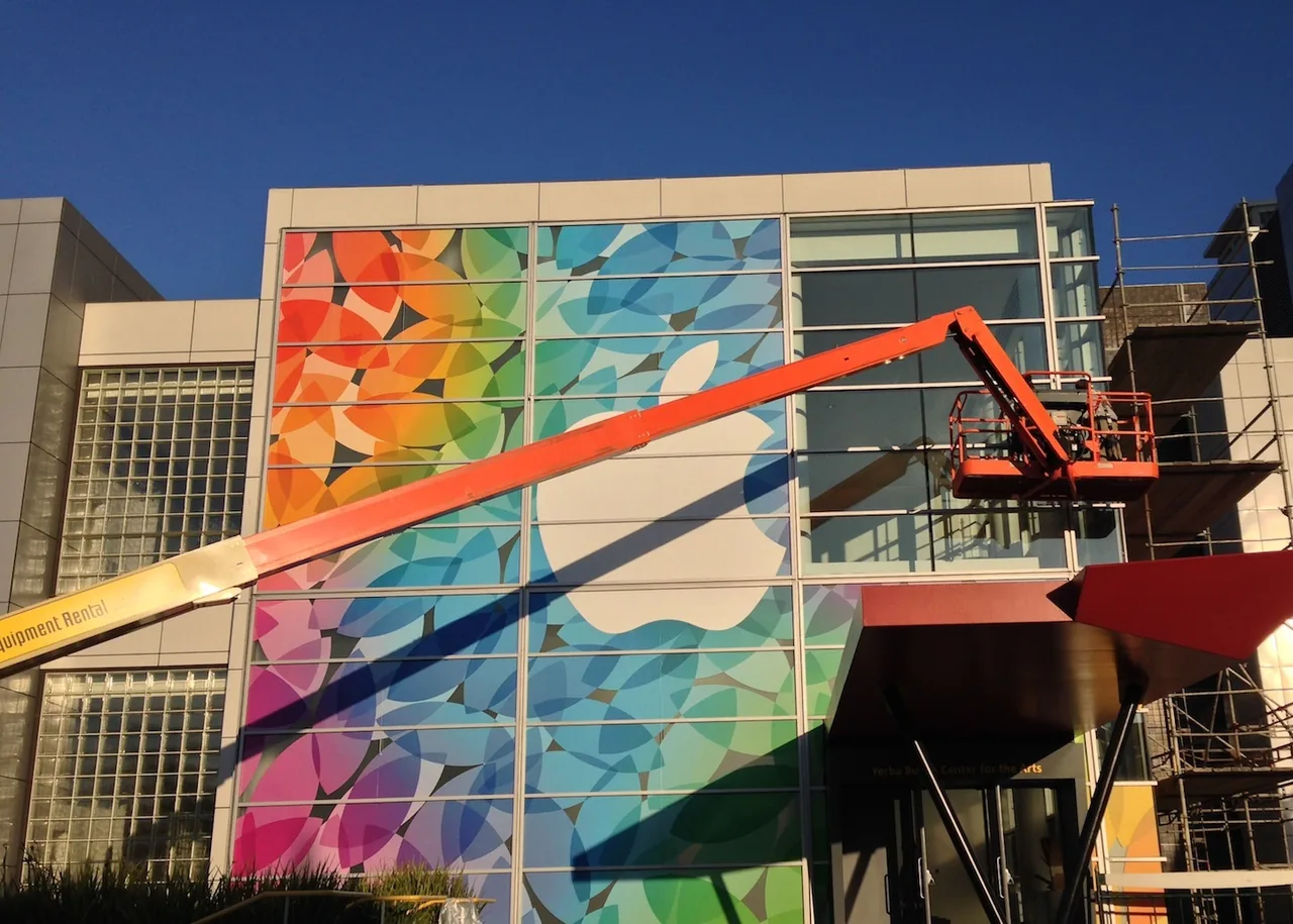
Cut lettering, printed film, frosted treatments, perforated graphics, and selected removable formats can create different appearances. They should be compared by the intended use rather than treated as interchangeable window products. A crisp business name with open glass around it is a different construction from a full-color image across several panes. A short promotion also raises different update questions from a long-term identity installation.
We discuss the surface, location, viewing requirements, and expected duration before recommending a specification. Tell us whether the glass has existing tint, coatings, or other treatments, and whether previous graphics are present. Compatibility should be reviewed for the actual glazing and chosen product. Do not assume a film is suitable for every window because it adheres to glass in a demonstration. The complete application matters, including the graphics, installation side, exposure, and removal expectations. Those details help turn a visual preference into a realistic project.
Plan which side the customer will read
Graphics applied to glass can be intended for an exterior viewer, an interior viewer, or both. The installation side and graphic construction influence the finished appearance. Artwork should be prepared for that arrangement so lettering reads correctly from the intended position. A simple mirrored file is not a complete specification when opacity, backing layers, and two-sided visibility also matter.
Consider what the reverse will look like from inside the premises. A display designed for the street can become a noticeable visual surface behind reception or seating. If messages are needed on both sides, discuss that requirement from the beginning rather than adding a second graphic later without review. We check the proposed views in the design conversation and use a clear pane reference for approval. That helps avoid confusion when several similar windows need different wording, or when some graphics are installed internally while others use a different arrangement.
Understand the limits of privacy effects
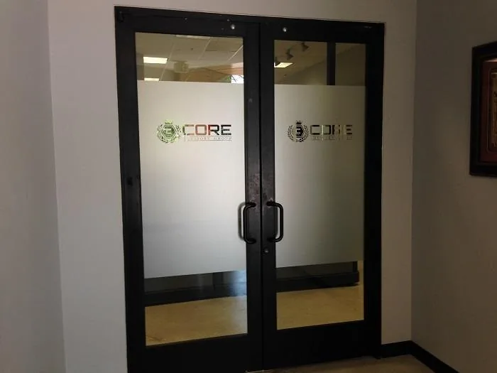
Frosted and other decorative treatments can change visibility through glass, but the privacy effect depends on the selected material and coverage. A partial band does not conceal everything above and below it. Perforated graphics should not be described as a guarantee of privacy in all lighting conditions. The relative brightness on each side of the window can affect what someone sees, particularly when the business interior is lit after dark.
Explain what you want screened and from which position. An office partition around seated conversations is a different brief from a street-facing window with changing indoor activity. We can discuss visual options and the need to assess them in the actual setting. If privacy is a critical operational requirement, it deserves a specific review rather than a broad marketing promise. A sample or limited test area can help clarify the intended appearance before a full installation is agreed, subject to the product and site.
Separate permanent identity from changing offers
A window display becomes difficult to manage when every update requires disturbing the company name or essential information. Plan the permanent and temporary elements as separate parts of the composition. Your identity can remain stable while a seasonal offer changes in a defined area. That keeps the frontage coherent and makes campaign updates easier to brief.
Give each promotional message an owner and an end date. Outdated offers can create customer confusion even when the graphics remain in good physical condition. Keep the text concise enough for the viewing position and avoid scattering related terms across several disconnected panes. Our promotional signs service can support the wider campaign while the window layout stays focused on the glass. Before choosing a changeable format, confirm how replacement or removal will work for the selected product. A graphic described as temporary does not automatically promise effortless removal from every surface or under every condition.
Make text and images work at the installed size
Provide the original logo and high-resolution artwork where available. A small image saved from a social post may not reproduce cleanly across a large window. Fine text, thin outlines, and low-contrast colors should be reviewed at the intended scale. What looks readable on a laptop can become difficult to distinguish against reflections or activity behind the glass.
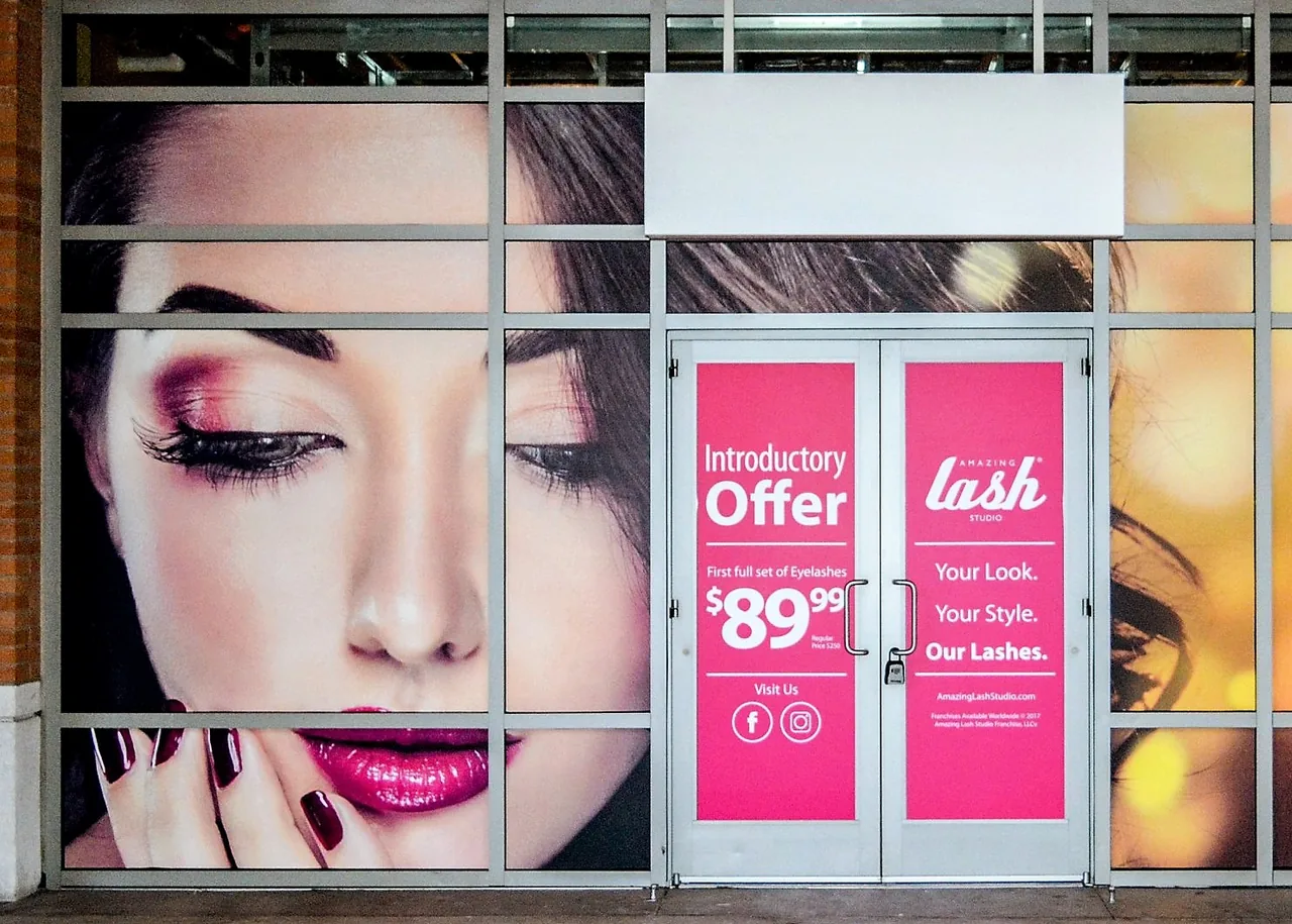
The image crop matters as much as resolution. Important faces, products, or brand details should not fall across frames or door hardware. Check the layout against measured panes and identify which areas cannot be covered. Color should be considered with the glass and background in mind, because a transparent or translucent construction differs from an opaque printed board. We discuss proofs and samples where appropriate. Artwork approval should cover the exact wording, pane positions, and intended viewing side, giving production a clear reference rather than a general visual idea with several unresolved details.
Prepare the glass and coordinate access
The installation plan should account for the glass condition, existing graphics, cleanliness, and surrounding access. Old film or adhesive may need separate removal work. Damage, coatings, or other surface concerns should be identified before the new graphics are produced. A photograph can begin the conversation, but it may not show every condition relevant to adhesion and compatibility.
Share the business hours and any restrictions on working around entrances, desks, or displays. For a new fit-out, coordinate the graphics with completed glazing and nearby finishes. The surface and environment need to be suitable for the chosen product's installation guidance. Ask what preparation is included in the scope and what must be completed beforehand. The purpose is a controlled application that fits the premises, rather than expecting an installer to resolve an unknown removal project or an unfinished window area at the last moment.
Set realistic care and replacement expectations
Window graphics need care appropriate to the supplied material and construction. Ask for cleaning guidance and share it with your cleaning team. The products used elsewhere on the building may not suit the graphic surface or exposed edges. Do not scrub a lifting edge or apply an improvised repair without advice, because the underlying condition may need a different response.
Expected life depends on the product, exposure, installation, and use; a fixed promise for every Houston window would be misleading. Discuss your required duration and future changes before approval. Keep the pane measurements, artwork files, and material references for replacement orders. A quote should identify graphics, removal where relevant, preparation, and installation, with exclusions clear. That makes comparing proposals more meaningful than looking only at a price per square foot, which may leave important differences in materials and site work out of the discussion.
Start with photographs and a clear message
Send the Houston address, full frontage photographs, close views of the glass, and the information you want displayed. Include the logo, approximate pane dimensions, any property criteria, and whether the work is permanent identity or a changing promotion. For interior glass, explain the use of the space and the effect you want from each side. Mention existing treatments or graphics rather than assuming they can stay beneath the new design.
Royal Signs & Awnings can help develop a window graphics brief that respects the view, the message, and the glazing conditions. Request a window graphics consultation or call (346) 644-6749. You may need a small amount of precise lettering or a more extensive composition across the frontage. In either case, clear priorities allow the material and layout to be chosen deliberately, so the windows contribute to the business without becoming an overloaded collection of competing text and images.
Let’s talk about your sign.
Share your location, artwork and project goals with our Houston team.
Request a ConsultationPROJECT QUESTIONS
Frequently asked questions
Can we keep part of the windows clear?
Yes. Coverage can be planned around the views and information you want to preserve. Discuss the whole frontage and any property or visibility requirements.
Do perforated graphics guarantee privacy at night?
No. Visibility can change with lighting on either side of the glass. Review the material and actual setting instead of assuming an all-day privacy effect.
Can graphics be installed inside the glass?
Some constructions can use an interior application. The artwork, viewing side, opacity, and glazing compatibility need to be specified for that approach.
Can a promotion be changed separately from the logo?
The layout can allocate separate permanent and promotional areas. Confirm replacement and removal options for the selected material before ordering.
What information is needed for an estimate?
Share the address, photographs, pane sizes, wording, logo, existing film details, and desired duration. Explain whether people should read the graphics from outside, inside, or both.