
Explore this page
The important decisions are often less obvious than the artwork itself. Will the wall show through? Should the graphics sit on the front face or be viewed through a clear panel? Do you want exposed stand-off hardware, concealed attachment, or raised letters on a backing panel? We help you work through those choices around the location and purpose of the sign. A finished piece should feel intentional from normal viewing distance and still look carefully resolved when someone stands beside it, rather than relying on a polished digital mockup alone.
Clear acrylic changes with its surroundings
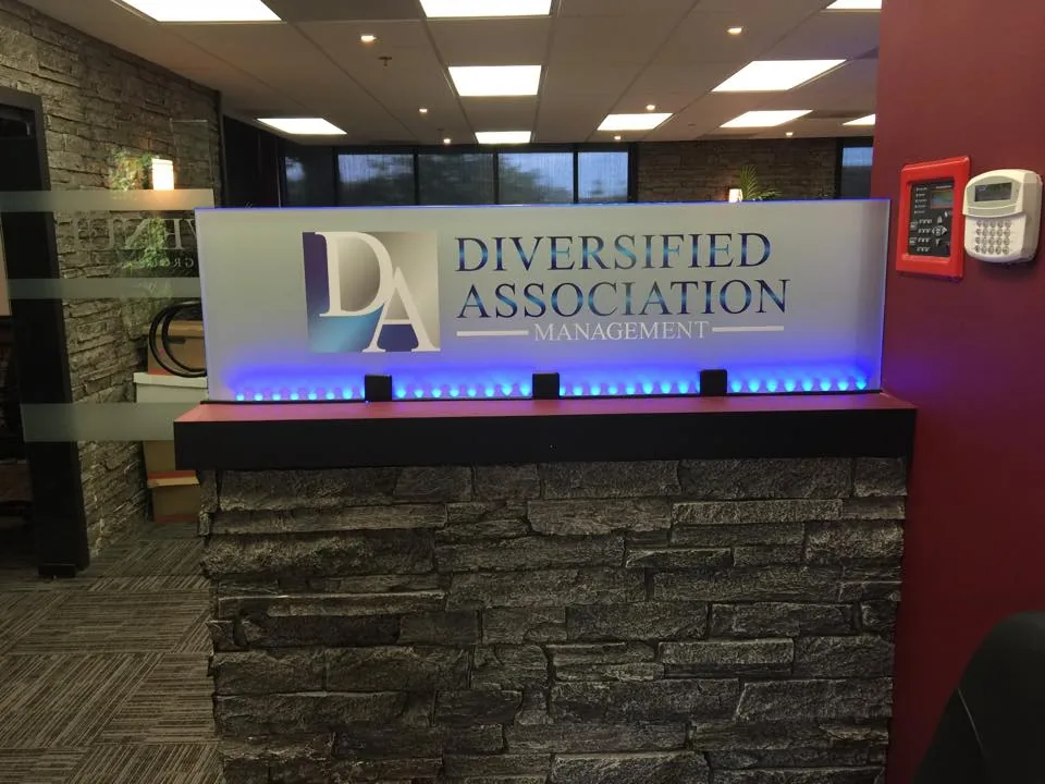
A clear panel allows the wall behind it to become part of the design. That can be attractive on a simple, evenly finished surface. It can also expose distractions that were not obvious in the artwork: paint marks, uneven texture, cables, or a color that reduces contrast with the lettering. The panel and its background need to be evaluated together, especially when a company logo uses thin lines or pale colors.
We discuss whether transparency adds something useful to your sign or merely follows a style you have seen elsewhere. A solid backing, selected printed areas, or a different opacity may give a stronger result. Think about what the wall looks like during the day and under the lights used in the evening. If the sign sits behind reception, the surrounding furniture and fixtures also influence the impression. Clear acrylic offers visual flexibility, but the whole setting must support the design.
Frosted and opaque finishes create a different balance
Frosted acrylic can soften the view through a panel while maintaining some light transmission. It is a useful visual direction when you want less of the wall or background to show. The effect depends on the actual material, finish, and lighting, so a sample is more reliable than assuming every frosted panel looks alike. Frosted signage should also not be confused with a privacy installation: a decorative panel does not automatically screen an entire room.
Opaque acrylic takes the background out of the equation and gives the graphics a more controlled field. That can suit bold brand colors, simple room markers, or signs installed against a visually busy wall. We look at contrast, reflected light, and the relationship between the panel and nearby finishes. Clear, frosted, and opaque options are not a quality ranking; each answers a different design problem. The right choice is the one that makes your information readable and fits the space.
Front-facing and reverse graphics are not interchangeable
Graphics can be applied to the face of a panel or arranged so they are viewed through clear acrylic from the front. A reverse or second-surface construction changes the layer order, and the artwork must be prepared for that approach. White backing, color coverage, and clear areas may affect how the finished graphics appear. These details should be resolved before production, not treated as an automatic setting after the design is approved.
Second-surface graphics place the image behind the clear face, but that does not make the complete sign scratch-proof or weatherproof. The exposed acrylic still needs appropriate care, and the overall construction must suit its environment. Face-applied graphics may be suitable for a different visual effect or updating approach. We discuss the appearance you want and the conditions the sign will face, then confirm the method in the specification. Neither method guarantees a particular sheen, price, or service life in every project.
Layering gives a logo depth without adding clutter
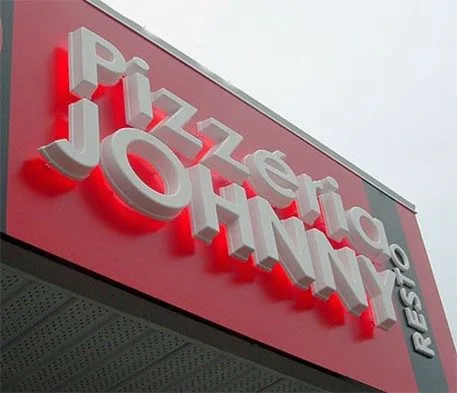
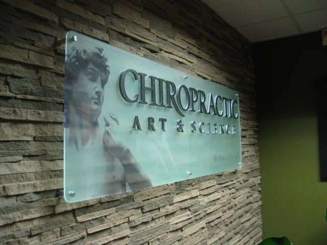
An acrylic sign can combine a backing panel with individually shaped elements. Raised letters, a separate logo symbol, or a contrasting layer can add depth while keeping the composition simple. The challenge is knowing when to stop. More layers do not necessarily create a better sign; they can crowd a compact logo or introduce edges that make cleaning more complicated. A well-balanced construction makes the important parts of the identity easier to recognize.
We consider which details should remain printed and which are worth turning into physical shapes. Fine lettering may work better as a graphic than as a separate cut piece, depending on size and production constraints. Larger symbols may lend themselves to a dimensional treatment. If your main interest is individual raised lettering rather than a panel, dimensional letters are another option to compare. Seeing those approaches side by side can clarify whether you want a material-led panel design or a wall-mounted lettering installation.
Edges, thickness, and hardware affect the finished impression
An acrylic panel is seen from more than straight ahead. Its thickness and exposed edge are visible as people walk past it, and the distance between the sign and wall changes the shadow it casts. Those details can be subtle, but they determine whether the piece feels like part of the interior or like an object added at the last minute. We discuss them alongside the front-facing artwork.
Stand-off mounts make the fixing hardware a deliberate feature. Other attachment methods may create a quieter appearance, subject to the sign size and mounting conditions. Panel dimensions, hole locations, and hardware must be compatible; a larger panel should not simply inherit the fixing arrangement from a much smaller one. Wall composition also affects attachment choices. Before installation is planned, identify the mounting surface and any restrictions on drilling. The appearance and support method should be designed together rather than considered as separate purchases.
Use acrylic where its character supports the information
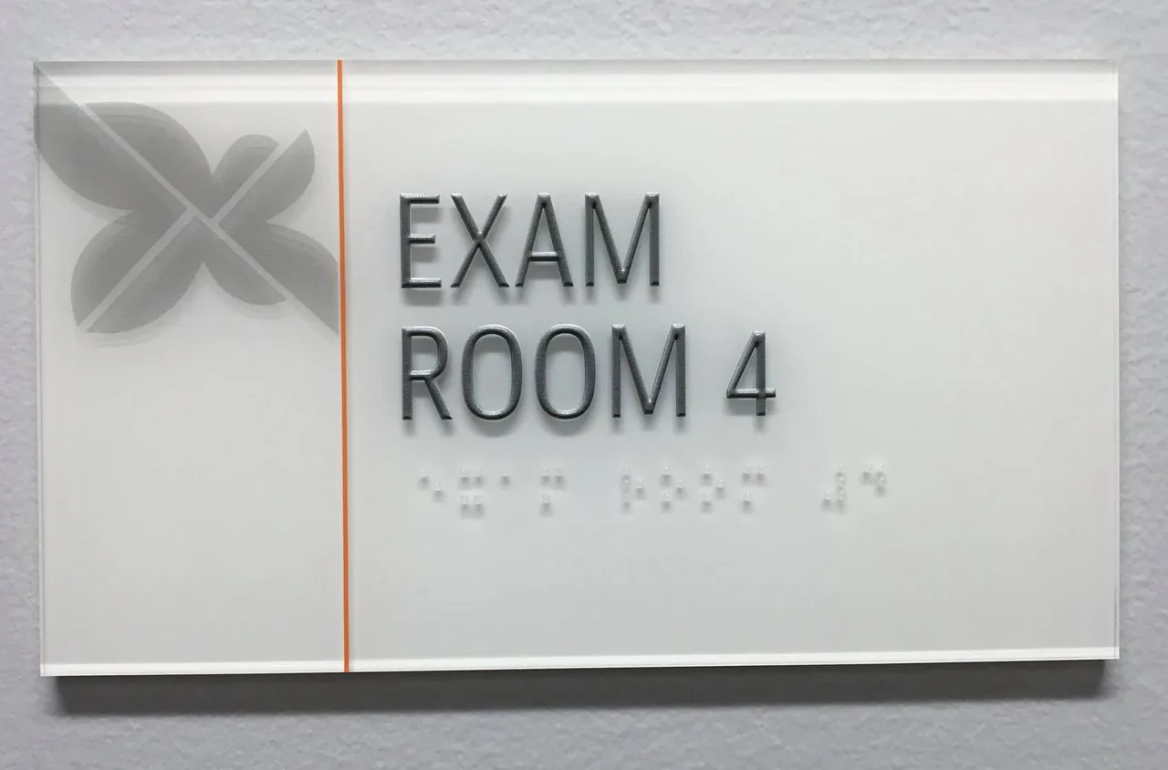
Reception identity, office directories, departmental panels, and selected room signs can all benefit from acrylic. A company with a minimal brand may prefer a clear panel and restrained graphics. A practice with a colorful identity may use an opaque face and a generous amount of open space. A shared business center may need a panel format that allows names to be updated. These are different briefs even though they share the same material.
Think about how close someone will stand to the sign and how quickly they need to read it. Decorative detail can be appropriate at reception but distracting in a directory. A glossy surface may need review in a strongly lit location. If you are coordinating several signs, our office signs service can help organize them into a consistent system. Acrylic is one material choice within that system, not a substitute for deciding what each sign must communicate and where it belongs.
Exterior use needs an application-specific specification
Acrylic is used in exterior signage, but an indoor panel should not be moved outside on the assumption that the material name guarantees suitability. The sheet grade, graphic system, hardware, support, and exposure all need to be considered. A sheltered entrance and an exposed roadside installation present very different conditions. For a Houston project, discuss sun exposure, rain, surrounding surfaces, and how the sign will be accessed for cleaning or future service.
The complete assembly matters. A suitable sheet does not compensate for unsuitable graphics or a weak attachment method. Similarly, an attractive edge treatment does not resolve structural demands. We review exterior requirements before confirming a construction and discuss applicable approvals for the proposed sign. If a different material is more practical for the location, it is worth considering rather than forcing acrylic into every application. The aim is a sign suited to its use, not simply a match to a preferred product name.
Good artwork makes the material worthwhile
Provide an original vector logo where available, along with approved colors and the exact wording. A small image copied from a website may not contain enough information for clean production at a larger size. If the design includes transparent areas, explain what you expect to see through them. A clear panel with a white logo is quite different from a white panel with a clear border, even when the digital artwork initially looks similar.
Color should be reviewed with the intended background and construction in mind. The same brand color can appear different on a screen, a printed layer, and a colored sheet. A physical sample or proof can help when a precise visual match is important. Check small text, punctuation, and logo proportions before approval. Once artwork and construction are agreed, retain that version for future matching pieces. That small organizational step makes later additions easier than trying to reconstruct the original design from a photograph.
Care for the surface as carefully as the design
Acrylic needs a cleaning routine that suits the specific sheet and graphics. For ordinary cleaning, manufacturer guidance commonly recommends mild soap, lukewarm water, and a soft cloth, but the instructions for the installed product take priority. Avoid assuming a cleaner used on nearby glass is suitable for the acrylic sign. Abrasives and incompatible chemicals can affect the surface, and dry wiping a dusty panel may drag particles across it.
Ask for care guidance when the sign is supplied, then share it with the person responsible for cleaning the space. Keep cleaning fluids away from parts that should not be wetted, including any electrical components in a specially illuminated assembly. Do not attempt to remove or tighten wall-mounted panels without considering their attachment arrangement. If a graphic becomes damaged, ask about replacement options rather than applying an improvised patch. A maintained sign should preserve both its readability and the intentional finish that made acrylic appealing in the first place.
Build a brief around the piece you want to see
For a custom acrylic sign quote, send the proposed location, approximate dimensions, logo artwork, and photographs of the surrounding space. Tell us whether you prefer clear, frosted, or opaque material, but leave room to compare alternatives if you are unsure. Mention whether the sign is indoors or outdoors, whether raised elements interest you, and whether the wording will need to change. Those details help us discuss a meaningful specification instead of estimating a generic panel.
Royal Signs & Awnings offers acrylic signage design, production, and installation for Houston businesses. We can help you move from a visual idea to choices about graphics, edges, mounting, and placement. Request a consultation or call (346) 644-6749 to discuss your project. The best acrylic sign is not the one with the most effects. It is the one where the material, the message, and the setting work together, so the finished piece looks at home in your business.
Let’s talk about your sign.
Share your location, artwork and project goals with our Houston team.
Request a ConsultationPROJECT QUESTIONS
Frequently asked questions
Are clear acrylic signs always easier to read?
No. The wall or background remains visible and can reduce contrast. Review the lettering against the actual installation surface before choosing a clear panel.
Can an acrylic sign have raised lettering?
A layered construction can combine a panel with raised letters or logo elements. The size and detail of the artwork determine what can be produced cleanly.
Can acrylic signs be used outside?
Some constructions suit exterior use. Sheet grade, graphics, hardware, exposure, and mounting should all be specified for the location rather than assuming any acrylic panel is suitable.
What is second-surface acrylic signage?
The graphics are arranged behind a clear panel and viewed through it from the front. The artwork and layer order must be prepared for that construction.
How should I clean an acrylic sign?
Follow the care instructions for the installed material and graphic system. Mild soap, lukewarm water, and a soft cloth are common manufacturer recommendations; avoid unapproved cleaners and abrasives.