

Explore this page
The sign does not need to repeat every detail from your main business sign. A compact logo, a recognizable name, or a carefully selected combination can be more useful at a pedestrian approach. The location and supporting arrangement are central to the project: the blade must work with the wall, nearby features, and the available view. We discuss where people come from and what they need to recognize before choosing the silhouette, face design, and illuminated or non-illuminated construction.
Study both directions of the approach
Walk toward the entrance from either end of the frontage. Notice when the business becomes visible and what blocks the view along the way. A column, tree, canopy, or neighboring projection can affect one direction more than the other. A blade that seems clear from one position may be hidden from a second approach. Wider photographs help show those relationships better than a close-up of the proposed wall fixing point.
For a Houston location, the relevant context might be a covered retail walkway, a neighborhood commercial block, or a cluster of entrances around a shared courtyard. The physical setting determines the design choices. We consider whether one or two faces serve the intended audience and whether the proposed position genuinely improves identification. The objective is a useful change in the viewing angle, not merely an extra object attached to the building because there happens to be an unused stretch of wall.
Keep the message suited to a compact sign
A blade sign is often viewed briefly and at an angle. The message should be organized for that situation. A long business name, slogan, list of services, and telephone number may be too much for a compact face. Decide which element lets someone recognize the business fastest. For a brand with an established symbol, that symbol may be central; for a newer business, the readable name may need more space.
We review the artwork at the intended scale and consider the relationship between text and background. Decorative borders can be attractive, but they should not leave the identity squeezed into the center. Small lines of information belong closer to the door where people can stop to read. If you are coordinating the whole frontage, storefront signs can carry the main business identification while the blade supports a different approach. Each sign can have a useful role without requiring the same crowded layout everywhere.
Choose a silhouette that belongs on the building
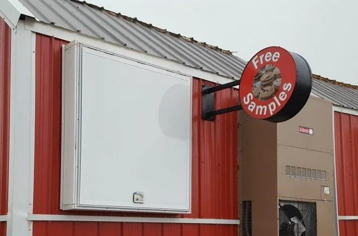
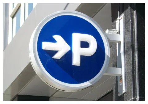
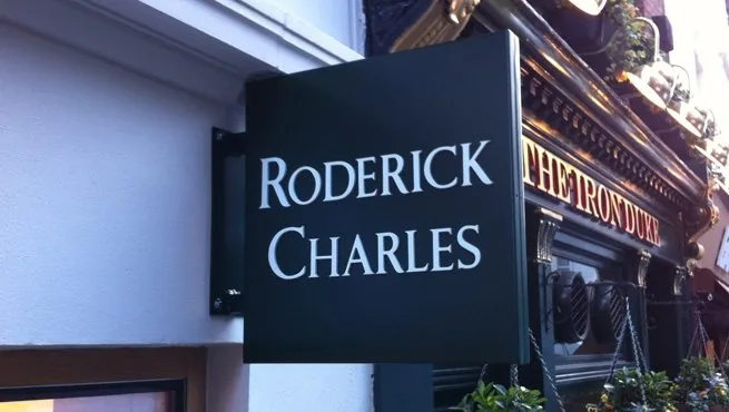
Circular, rectangular, and custom-shaped blades each create a different impression. The right silhouette should relate to your brand and the architecture rather than follow a shape simply because it is fashionable. A detailed logo outline may introduce small elements that are difficult to fabricate or read. A more restrained face can preserve recognition and give the business name room to breathe.
Think about the sign from the side as well as the front. The edge, depth, bracket, and spacing from the wall are visible parts of the finished installation. A traditional-looking bracket and a sharply modern face may work together deliberately, but the combination should be reviewed as a whole. We discuss finish colors and construction around the building setting. The result should look considered when someone approaches the entrance, not like a logo panel purchased independently from an unrelated piece of mounting hardware.
The bracket is part of the design and the support
A blade extends away from the wall, so its support arrangement deserves more attention than a decorative detail in the artwork. The sign size, weight, mounting surface, and site exposure affect the proposed fixing and bracket design. Existing brackets need assessment before reuse. Their appearance alone does not establish that they are suitable for a new sign with different dimensions or construction.
Share information about the wall and any property restrictions early. A finished cladding surface may not describe the supporting structure behind it. The installation plan needs to account for that distinction, with professional review appropriate to the work. We do not prescribe a universal bracket size or attachment method from a photograph. The aim is a coordinated specification where the blade face, support, and building connection are considered together. That approach gives the visual design a realistic basis and prevents mounting questions from being deferred until the sign is already made.
Review clearance and the space around the sign
A projecting sign occupies space beyond the wall plane. Pedestrian routes, doors, windows, canopies, and nearby equipment all need to be considered. A proposed location should be reviewed for clearances and applicable rules rather than assuming that a sign small enough to look unobtrusive is automatically permitted. The exact address, property conditions, and design determine the requirements that apply.
The sign must also be reachable for future service without creating an unnecessarily difficult maintenance arrangement. If it is close to an awning or lighting fixture, consider whether either item will obscure it or complicate access. We discuss placement with the property requirements in view. Approval of an attractive mockup does not resolve a conflict with a walkway or a building feature. An early site review helps establish a workable location so the design can develop around real conditions instead of relying on a position that later needs to change.
Illumination should match the face and setting
A restaurant open in the evening may have a different visibility requirement from a business used mainly during daylight. Check the approach after sunset before choosing lighting. Existing fixtures, neighboring signs, and the light from interior windows can change the background dramatically. A non-illuminated blade may be sufficient in one setting and difficult to recognize in another.
If an illuminated construction is proposed, discuss the appearance of both faces, electrical arrangements, and access for service. The lighting method should suit the sign assembly and available space. A blade is not automatically backlit, and its shape does not determine which effects are feasible. We can review lighted signs as a broader option while keeping the projecting installation specific to your building. The useful objective is readable identification after dark where required, with the illumination integrated into the design rather than added as a promise of extra brightness.
Coordinate the blade with neighboring businesses
In a shared development, several projecting signs may be visible along the same walkway. Property management may use a consistent size, mounting zone, or bracket style to keep that view organized. Your own identity can remain recognizable within those boundaries. Ask for the current sign criteria rather than assuming the neighboring installation represents the rules now in force.
Consider the rhythm of the frontage as well as the individual sign. A blade placed too close to another projection can create a confusing cluster from an angled approach. If a canopy or entrance feature already identifies the unit, discuss whether the blade adds useful information. The best reason to commission it is a genuine visibility need. We help explore the proposed position and appearance around the property context, with approval responsibilities recorded clearly. That allows the business to express its brand while respecting the shared architecture and the way customers navigate between units.
A projecting sign and a suspended sign are different choices
The words hanging and blade are sometimes used loosely, but the mounting arrangement matters. A blade commonly projects from a wall or supporting bracket and presents its face perpendicular to the facade. A suspended sign hangs from an overhead support. The two may serve similar visual goals, yet they require different site information and installation decisions. Describe the location and effect you want rather than relying only on a product label.
Our hanging signs service can help you explore an overhead approach where that suits the setting. For a blade project, we focus on the projection, face orientation, support, and clearances around the wall. This distinction also helps compare quotations: a panel supplied with decorative hanging hardware is not necessarily equivalent to a complete projecting assembly installed on a building. Confirm what is being proposed, how it attaches, and whether the scope includes the site work needed to make the finished sign usable.
Plan the quote around the full installation
Dimensions, shape, face materials, depth, graphics, bracket construction, illumination, and installation access can all affect a blade sign proposal. A price for the printed face alone leaves several important decisions unresolved. Where an older sign is being replaced, removal and the condition of the existing wall or bracket may also matter. Ask for a scope that identifies the whole assembly and the work included. Share the planned opening or refurbishment date, but allow time for design decisions, property approval, and any public approvals required for the installation. The schedule should be confirmed for the actual project. Keep the approved artwork and specification for later replacement or maintenance. Cleaning and care should suit the supplied materials, and any damage to the bracket or attachment should receive professional attention. The sign is part of the building environment; maintaining its support and appearance is as relevant as keeping the business name current.
Show us the approach you want to improve
Send photos looking along the frontage from both directions, plus a wider view of the proposed wall area. Include your Houston address, logo, approximate preferred size, operating hours, and property criteria. Mention an existing bracket if there is one, but do not assume it can be reused. Tell us whether the challenge is a hidden entrance, an angled approach, or a name that only becomes visible when visitors are already standing at the door.
Royal Signs & Awnings can help turn that information into a focused blade signage brief. Request a blade sign consultation or call (346) 644-6749 to discuss the design and installation options. A well-chosen projecting sign adds a useful view of your identity. It works best when the shape, wording, support, and position are considered together, allowing people approaching alongside the building to recognize the business before they reach the entrance.
Let’s talk about your sign.
Share your location, artwork and project goals with our Houston team.
Request a ConsultationPROJECT QUESTIONS
Frequently asked questions
What is the main purpose of a blade sign?
It presents a face toward people approaching along the facade, where a flat wall sign may be difficult to see. The benefit depends on the actual view and placement.
Can a blade sign have two faces?
Yes, where a suitable double-sided construction serves approaches from both directions. Artwork orientation and the complete assembly need to be specified.
Can my existing bracket be reused?
Only after its condition and suitability for the proposed sign are reviewed. A larger or heavier replacement may need a different support arrangement.
Are blade signs and hanging signs identical?
Not necessarily. A projecting blade and an overhead suspended sign have different mounting arrangements. Explain the proposed location so the correct construction can be discussed.
Do small blade signs avoid approval requirements?
Size alone does not establish an exemption. Property criteria and applicable public requirements should be checked for the address and proposed installation.