
Explore this page
The design should begin with what people need to find and where they will look. A retail aisle marker is a different brief from a branded entrance panel or a suspended directory. The sign face, suspension arrangement, supporting structure, and surrounding space all need to work together. We discuss the intended location and viewing positions before choosing materials or decorative hardware. A hanging sign earns its place when it makes the setting easier to understand and belongs visually within it, rather than simply filling unused space above the customer's head.
Choose the destination before the panel style
Decide exactly what the sign identifies. A department name helps shoppers choose an aisle; a business name confirms an entrance; a reception marker can orient visitors in a large lobby. Those messages should not be merged automatically. A suspended panel that tries to identify the business, explain its services, and point toward three destinations may become difficult to use even when the artwork looks attractive.
Think about what a first-time visitor already knows. Someone entering a store may be looking for a product category, while someone attending an appointment may need the name used in their booking message. Keep the wording consistent with other customer information. We help review the message before selecting its format, so a decorative outline does not constrain the useful text too early. The right sign can be restrained and still make a noticeable difference when it appears at the point where someone needs that information.
Look at the ceiling as part of the site
The visible ceiling is not necessarily the supporting structure for a suspended sign. Ceiling tiles, decorative panels, exposed services, beams, and roof assemblies create very different mounting conditions. The attachment arrangement must be appropriate for the sign and the available support. Do not assume a familiar hook or cable system is suitable because it has been used for a lightweight decoration nearby.
Share ceiling photographs, approximate height, and any building information available. Tell us whether the premises are being fitted out or already operating, and whether the property has rules for overhead installations. The planned support location may need review with building management or the other project professionals. We discuss those conditions before confirming the assembly. A clear understanding of what the sign will hang from gives the design a practical basis and avoids leaving the most important mounting question until after the panel has been produced.
Set the viewing height without obstructing the space
A hanging sign needs to be visible while remaining compatible with movement and the use of the space. The intended height should be reviewed with applicable clearances, door operation, equipment, and pedestrian routes in mind. It also needs to work with the furniture or displays beneath it. A panel positioned from an empty floor plan may later be obscured by tall shelving or a changing promotional display.
Consider the normal approach from entrances and aisle intersections. Look at the sign position from several distances, including the point where someone makes a decision. The relevant height is not a universal number chosen from a product catalog; it depends on the setting and requirements. We can discuss the proposed placement around the actual space. That review also helps determine whether an overhead sign adds useful information or whether a wall-mounted format would be easier to see and maintain in that particular location.
Design both sides with their readers in mind
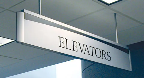
A suspended sign can be seen from opposite directions, but the two faces do not always need identical content. A shopper entering an aisle may need a product category; someone leaving it may need a direction toward checkout or another destination. For business identification, matching faces may be appropriate. The decision should follow the customer route rather than an assumption that double-sided printing means duplicating the artwork without review.
Arrow directions require particular care. A graphic that points correctly on one face can become misleading if copied thoughtlessly to the reverse. Label the intended viewing direction in the artwork approval process. Keep the visual identity consistent while checking each face independently. We consider the information with the panel orientation so the installed sign answers the right question from either side. That practical attention is more valuable than adding extra text simply because a second printable surface happens to be available.
Use contrast and spacing before adding decoration
Overhead information is often read while a person is moving. Clear lettering and a manageable amount of text help it do its job. A decorative font that suits a close-up brand feature may be less useful for an aisle marker viewed across a shop. A subtle color combination can also disappear against the surrounding ceiling or displays. The background is part of the design, even when the sign is suspended away from a wall.
We discuss type scale, line breaks, and open space around the wording before refining decorative details. If a company logo is included, it should support recognition rather than crowd the destination name. The outline, edge treatment, and hardware can then contribute character without competing with the information. For a group of hanging signs, repeat a clear visual system. Customers should be able to recognize the next marker without learning a different design language every time they move to another part of the business.
Match materials to the setting and expected changes
A hanging panel's material affects its weight, finish, and relationship to the suspension system. Interior and exterior applications need different consideration, and the complete assembly should be specified for its intended use. A panel described as suitable for outdoor graphics does not by itself establish that the chosen hardware or support arrangement is suitable outdoors. We discuss the product and mounting conditions together.
For an interior sign, consider reflections from lights, the appearance of exposed edges, and how the information will be cleaned or updated. Acrylic signs may offer an appropriate panel style in some settings; another construction may suit the space better. If departments or tenant names change regularly, say so before the sign format is chosen. Replacing a graphic face, an insert, or the entire panel can involve different work. The material decision should therefore account for the ongoing use of the sign as well as its first appearance.
Exterior suspension needs its own review
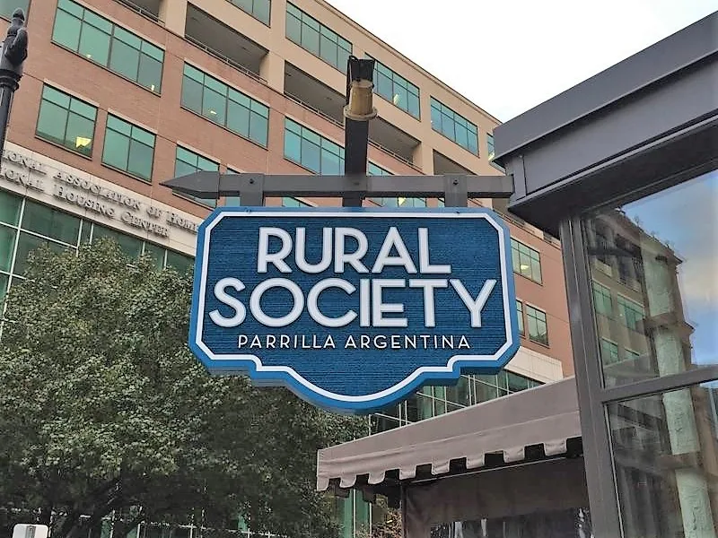
A hanging sign under an entrance canopy may appear sheltered, but it is still an exterior installation. Exposure, movement, fixing conditions, and the supporting structure need attention. A covered position does not remove the need to review the assembly for its environment. Property consent and applicable public approvals should also be checked for the proposed work and address.
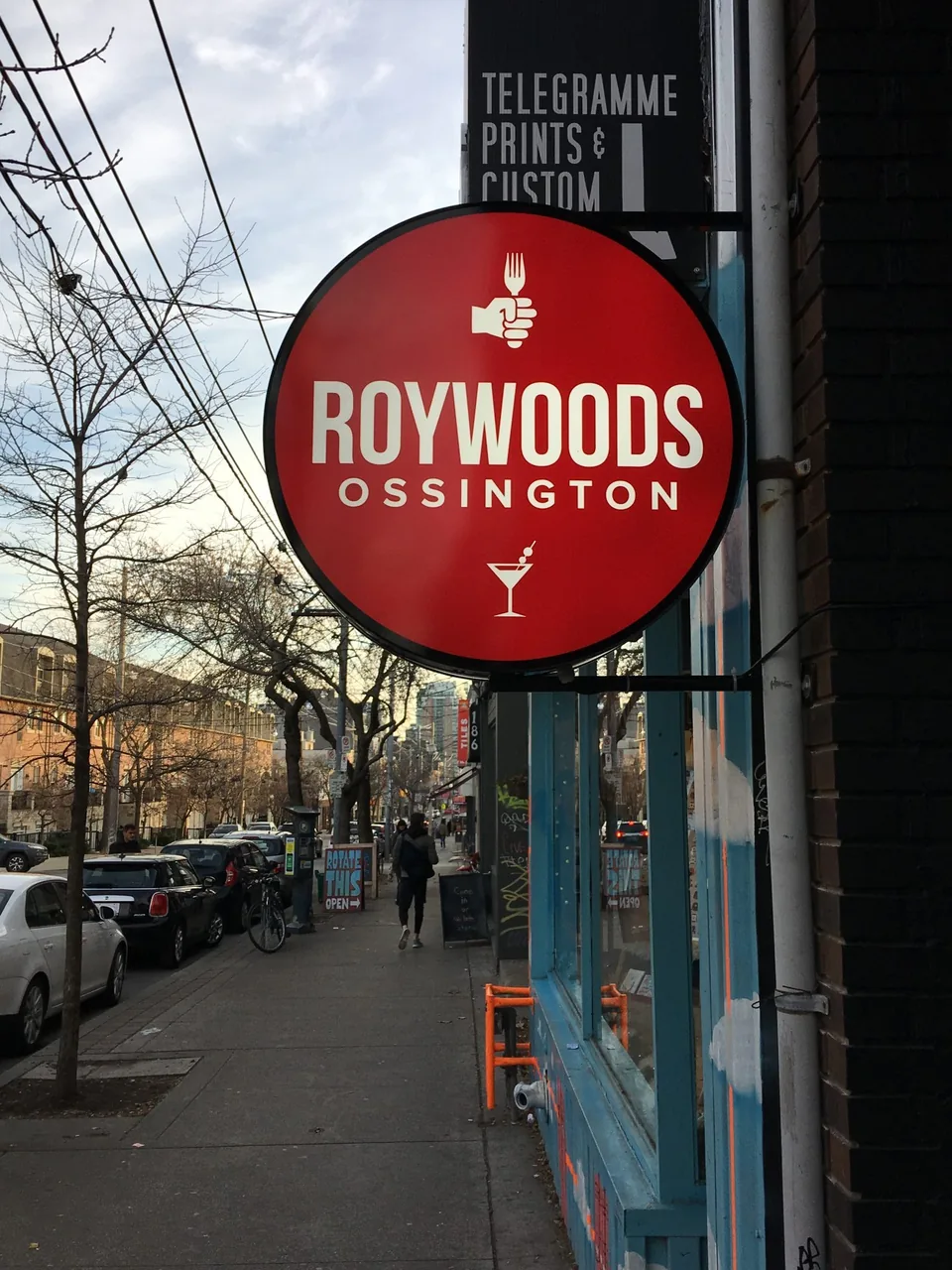
Tell us whether the sign is intended to remain fixed in orientation or whether a moving decorative effect is part of the idea. That affects the design conversation and cannot be left to an arbitrary choice of chain or cable. If your real requirement is a sign projecting from the wall toward an approaching pedestrian, blade signs may be a more relevant construction to compare. The important distinction is the support and presentation you need. We can help clarify it from photographs and site information before the design is committed to the wrong format.
Coordinate groups of signs as one system
Several suspended markers should work together across the space. Establish a consistent naming pattern, alignment, and visual hierarchy before ordering the first group. A mixture of category names, department abbreviations, and numbered locations may confuse shoppers unless the system is explained clearly. Keep the terms useful to the people visiting, rather than relying on internal stock or staffing codes.
Record the sign positions against a current plan and check the view between them. Too many overhead messages can compete, while a missing marker at a key intersection can leave the route incomplete. For a larger navigation project, wayfinding signs can coordinate suspended elements with wall directions and destination identification. A sign family should remain coherent as the business grows. Retaining artwork and specifications for future additions helps avoid a patchwork of almost-matching panels that gradually becomes harder for customers to follow.
Plan installation, access, and later updates
Overhead installation affects the space beneath it. Discuss operating hours, the availability of suitable access, and any areas that must be kept clear while work takes place. Building procedures can influence scheduling, especially where access is shared or security arrangements apply. For a new fit-out, coordinate the sign with completed ceilings, lighting, and other fixtures rather than treating it as an independent final decoration. A quotation should identify the panel construction, graphics, suspension hardware, attachment work, and installation scope. Removal of previous signs or adjustments to the supporting area should be addressed separately where relevant. Ask how future updates will be accessed and what records should be retained. A sign that is difficult to reach can complicate a routine wording change. Cleaning and maintenance should follow the supplied instructions, and staff should not improvise alterations to the suspension system when they need to move or replace the panel.
Turn an overhead idea into a useful sign brief
Send photographs of the space from the customer approach and include views of the intended support area. Share your Houston address, proposed wording, logo, approximate panel size, and whether one or two faces are needed. Explain what the sign should help people find and whether the information will change. Property restrictions, ceiling details, and the planned opening or renovation date are also helpful.
Royal Signs & Awnings can discuss hanging signage as part of your entrance, retail floor, or commercial interior. Request a hanging sign consultation or call (346) 644-6749 to review the design and installation options. The project does not have to begin with a fully specified suspension system. It begins with a clear purpose and an honest view of the location. From there, the message, material, orientation, and supporting arrangement can be developed together so the finished sign contributes something useful to the way people experience your business.
Let’s talk about your sign.
Share your location, artwork and project goals with our Houston team.
Request a ConsultationPROJECT QUESTIONS
Frequently asked questions
Can hanging signs be used inside a business?
Yes. Suspended signs can identify departments, aisles, reception, or other destinations where the location and support arrangement are suitable.
Can both faces show different information?
They can, if the construction permits it and the messages serve the opposite approaches. Review each face and any arrows independently.
Can a sign be hung from ceiling tiles?
Do not assume the visible ceiling tiles provide suitable structural support. The actual attachment arrangement needs review for the sign and building conditions.
Are covered outdoor locations treated like interiors?
No. A canopy may provide some shelter, but an exterior assembly still needs an application-specific review of materials, support, exposure, and approvals.
What affects the cost of a hanging sign?
Panel size, material, graphics, faces, hardware, support conditions, and installation access affect the scope. Discuss future updates when selecting the format.