
Explore this page
Custom informational signs help Houston businesses explain where to go, what to do, which rules apply, and what visitors should expect next. Royal Signs & Awnings plans sign systems for commercial interiors, exterior areas, parking zones, campuses, offices, and customer facilities. The process begins with the decisions people make at the site, then turns those decisions into short, visible messages. Call (346) 644-6749 or send the project address, photographs, floor plan, and message list through the contact form to begin a practical review.
Information signs should remove uncertainty
An effective information sign answers a question at the moment the question occurs. A driver approaching a shared entrance may need to know which lane to use. A visitor entering a medical office may need check-in instructions. A delivery team may need a receiving location, while employees need rules for a restricted area. Listing every possible instruction on one panel creates more confusion. The sign plan should identify each decision point, select the one message required there, and direct the viewer to the next confirmation. This sequence turns separate panels into a useful communication system instead of a collection of posted notices.
Map the property before writing messages
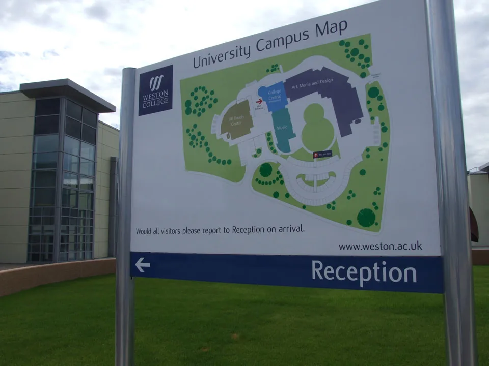
A site walk or current plan helps reveal how people actually move through a property. Mark vehicle entrances, pedestrian doors, reception points, elevators, corridors, service areas, restrooms, exits, and destinations that regularly generate questions. Then note where a visitor first needs information and where reassurance is useful after a turn. Staff feedback can expose recurring problems that are not obvious from a drawing. The objective is not to place a sign at every intersection. It is to use the fewest clear messages needed to help first-time visitors complete their trip without unnecessary detours or repeated questions.
Create a hierarchy for directions, rules, and warnings
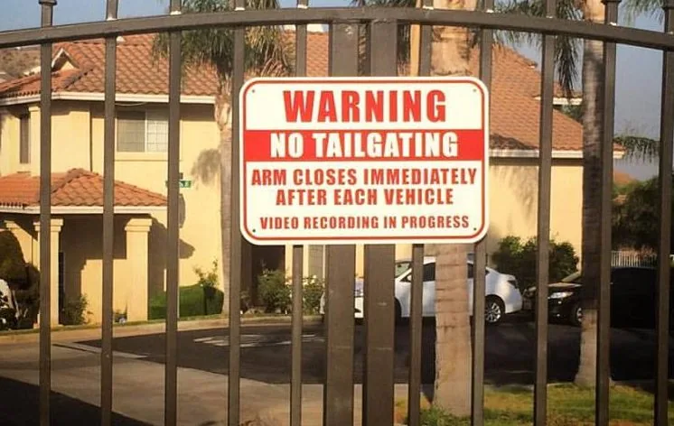
Directional information, operational instructions, property rules, and hazard messages do not carry the same urgency. They should not look identical. A destination name should be recognized quickly, while a detailed procedure may be read from a closer position. A warning needs enough contrast and separation to be noticed without competing with unrelated marketing. Organizing sign families by purpose makes the property easier to understand. Typography, color, symbols, panel shape, and placement can establish that hierarchy, but the distinctions must remain consistent. When every notice uses a different style, viewers spend time interpreting the design instead of acting on the message.
Write for the distance and time available
The amount of copy should match the way a person encounters the sign. Drivers and moving pedestrians need brief wording, large characters, recognizable arrows, and strong contrast. A lobby directory can support more detail because the viewer can stop. A rule panel near a queue may include several short points, but each point still needs a clear order. Avoid internal department terms that visitors may not understand. Use familiar destination names and direct verbs. Reviewing artwork at actual size and from the expected distance is more reliable than judging it only on a computer screen where small text appears deceptively readable.
Use arrows and symbols consistently
Arrows are functional information, not decoration. Their direction, position, and relationship to the destination name should remain predictable across the property. A left arrow should not be placed on the right side in one corridor and the left side in another without a reason. Symbols can help people recognize restrooms, accessibility features, exits, elevators, parking, and services, especially when audiences speak different languages. However, unfamiliar icons can create ambiguity. Use widely understood symbols where appropriate, pair them with words when clarification is needed, and confirm that decorative graphics do not resemble operational symbols or compete with essential directions.
Choose materials for the actual environment
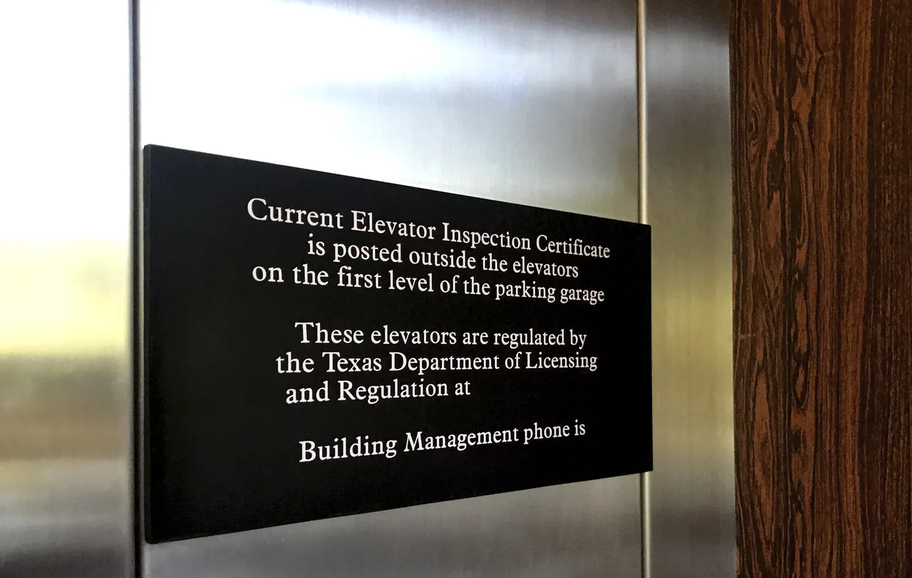
Informational signs may be mounted to walls, doors, posts, fences, counters, windows, or freestanding supports. Indoor panels can prioritize close-range finish and integration with the architecture. Exterior signs must account for sun, rain, humidity, landscaping, irrigation, impact, cleaning, and how the substrate is attached. Reflective treatments may be relevant where visibility under headlights matters, while changeable inserts may be better for departments or tenant names that move. Material selection should follow the exposure, expected duration, replacement frequency, and maintenance plan rather than relying on one substrate for every message.
Plan directories and changeable information
Directories often fail when they are designed only for opening day. Tenants move, departments change names, staff assignments shift, and room uses evolve. A modular directory can preserve the frame and visual system while allowing individual lines or panels to be replaced. The update method should be simple enough to maintain but controlled enough to avoid mismatched fonts, taped notices, and handwritten corrections. Keep a master destination list and approved naming conventions. If a change affects multiple signs, update the entire path from the arrival point to the destination so old and new information do not conflict.
Coordinate accessibility and permanent room identification
Some permanent room and facility signs may be subject to accessibility requirements involving wording, characters, tactile content, Braille, contrast, mounting location, or other details. The applicable scope depends on the property and sign function, so it should be confirmed before production. Accessibility should be integrated into the information system rather than treated as an unrelated add-on. Room names, numbers, directional references, and directories should use the same approved terminology. The design can support the brand while keeping required information clear, properly located, and easy for users to find. Do not assume a decorative room plaque satisfies every applicable requirement.
Keep operational signs separate from advertising
A promotional message asks for attention; an informational message helps someone complete a task. Combining the two can weaken both. A visitor looking for check-in instructions should not have to read through an offer or service list. Reserve high-priority areas for directions, identification, rules, and safety information, then place marketing where people have time to consider it. Brand colors and type can connect the system visually without turning each instruction into an advertisement. This separation also makes updates easier because operational information can remain stable while campaigns, offers, and seasonal graphics change on their own schedule.
Review wording with the people who use the site
Managers know the official names of departments, but reception staff, maintenance teams, security personnel, tenants, and delivery drivers often know where confusion happens. Ask which questions occur repeatedly and which unofficial terms visitors use. A technically correct sign can still fail if its destination name differs from appointment instructions or the words used by staff. Before approval, check spelling, arrows, room numbers, bilingual needs, operating instructions, and responsibility for future updates. A short field test with someone unfamiliar with the property can reveal assumptions that are invisible to the project team.
Plan fabrication and installation as one system
Final artwork should reflect verified dimensions, sightlines, mounting surfaces, door swings, glass panels, landscaping, lighting, utilities, and access conditions. The scope should state which signs are wall-mounted, suspended, post-mounted, applied to glass, or supplied for customer installation. It should also identify removal, surface repair, permits, engineering, electrical work, or property coordination when applicable and confirmed. Numbering each sign on a location plan helps the installer match the approved message to the correct position. Accurate records also simplify replacement when a single panel is damaged or a destination changes.
Request a quote for Houston informational signs
Royal Signs & Awnings can help organize a new information system or improve an existing group of signs that no longer guides people effectively. Share photographs from normal approach angles, a floor or site plan when available, the wording currently in use, recurring visitor questions, and any brand or property standards. The team can then review sign types, message hierarchy, materials, changeable components, and installation needs. Call (346) 644-6749 or use the contact form to discuss informational signs for a Houston business, office, facility, campus, or managed property.
Audit the system after opening
Observe the site after the signs are installed. Walk the route as a first-time visitor, drive each entrance where safe, and ask staff whether common questions have changed. Check that landscaping, open doors, parked vehicles, temporary displays, and normal activity do not hide critical information. Confirm that arrows point correctly and names agree across the website, appointment messages, directories, and rooms. Record any adjustment rather than adding an improvised notice. A short post-installation audit helps the business correct small issues and gives it a dependable reference when the property expands or another location adopts the system.
Create one controlled source for every message
Information systems drift when room names, arrows, rules, and operating instructions are stored in separate emails or remembered by different employees. Build a sign schedule that gives each item a unique number, exact approved wording, location, direction, size, material, mounting method, and revision date. Compare the schedule with floor plans, tenant lists, appointment communications, parking instructions, and online directions before production. If a department has both an official name and a shorter public name, choose the version visitors will understand and use it everywhere. Establish who may request a change and who approves it, especially when the message affects safety, access, or property operations. When a revision occurs, search the schedule for every related reference instead of replacing only the most visible panel. This controlled source supports accurate proofs, installation labels, future reorders, and phased expansion. It also helps prevent contradictory signs from remaining in service after a tenant moves, a doorway changes function, or a policy is updated. Store final artwork, photographs, measurements, and installation notes with the schedule. The physical signs then become the visible output of a maintained information process, not isolated objects that slowly become inaccurate. That discipline is especially valuable for campuses, medical offices, shared properties, industrial facilities, and organizations where many people contribute operational content.
Related services
Explore: Wayfinding Signs | ADA Signs | Room ID Signs | Office Signs | Wall Signs
Let’s talk about your sign.
Share your location, artwork and project goals with our Houston team.
Request a ConsultationPROJECT QUESTIONS
Frequently asked questions
What is an informational sign?
An informational sign communicates directions, instructions, rules, facility details, warnings, or other information people need to use a property.
How is an informational sign different from a promotional sign?
Informational signs help a viewer complete a task or understand a requirement. Promotional signs are designed to advertise an offer, event, product, or brand message.
Can information signs be updated later?
Yes. Directories, room panels, inserts, and modular systems can be designed for updates when departments, tenants, names, or instructions change.
What should I provide for a quote?
Provide the project address, photographs, approximate dimensions, a site or floor plan if available, the complete message list, brand standards, and property requirements.
Do permanent room signs need accessibility features?
Some permanent room and facility signs may have accessibility requirements. The applicable standards and project scope should be confirmed before design and production.