
Explore this page
The project is more than a collection of arrows. It can combine directories, directional markers, building identifiers, and destination confirmation, each placed for a particular job. We discuss the routes people actually use and the information available at each decision point. The aim is to create a coherent system that an unfamiliar visitor can follow, while keeping the design connected to your property or brand. That requires understanding the space before deciding the quantity of signs, because more panels do not automatically make a complicated route easier to understand.
Begin with the people who are trying to arrive
Different visitors know different things when they enter a property. An appointment holder may have a company name and suite number. A delivery driver may need a loading entrance. A customer visiting a service department may recognize a public-facing name that differs from the internal department title. Those starting points should influence the messages you provide, rather than expecting everyone to understand your organization's own terminology.
Identify the most important journeys and describe what the visitor knows at the beginning of each one. Include the entrance they are likely to use and the place they need to reach. We can then discuss how those journeys overlap and where they diverge. A system designed only around staff familiarity can miss the uncertainty first-time visitors face. Useful wayfinding gives people recognizable information at the right moment, without requiring them to learn an internal naming scheme or ask for an explanation before they can begin.
Walk the routes and mark the decisions
A floor plan is a useful reference, but it does not show every obstacle in the visitor's view. Walk the route from arrival to destination and record where a person must turn, choose a corridor, enter a building, or move to another floor. Notice what is visible from that position. A directory hidden behind an open door or an arrow beyond the junction may be in the right area on the drawing but still fail in use.
Photographs and a current plan help build a shared understanding of those decision points. Include changes in level, controlled-access doors, and entrances with different operating arrangements. Avoid treating an informal shortcut used by staff as the intended visitor route. We discuss which journeys the signage should support and how the messages connect. This route review can reveal that a missing confirmation sign is the real problem, rather than the absence of another large directory at the main entrance.
Use different sign roles deliberately
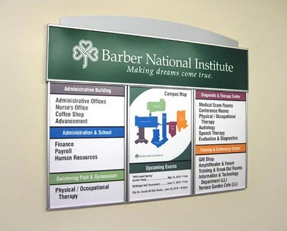
An orientation sign helps people understand the overall layout. A directional sign points toward the next part of the journey. An identification sign confirms that they have reached a building, department, or room. These roles complement one another, but they are not interchangeable. A destination name displayed only at the entrance does not provide directions through a complex site, and a series of arrows is incomplete without confirmation at the end.
We help organize the proposed signs around those functions. A property directory may connect company names to buildings or suites, while directional markers handle the route between them. Destination identifiers then use the same wording to close the journey. For a workplace package, office signs can support the room and suite information within that wider plan. The navigation system should remain understandable across the handoff from one sign role to the next, instead of requiring visitors to guess whether two different labels refer to the same place.
Create a naming system that stays consistent
A destination can acquire several names over time: the official department title, a shortened version used by staff, and a label left over from an earlier layout. Choose the public-facing wording before production and use it consistently. The signs, appointment messages, reception instructions, and relevant maps should agree. A visitor should not have to decide whether Client Services and Customer Center are one destination or two.
Building letters, floor numbers, and suite identifiers also need a clear pattern. Avoid changing the format midway through a route. If the site has several entrances, decide how they are named and which names appear in visitor communications. We review the sign messages as a connected set rather than checking each panel in isolation. Consistency reduces the amount of interpretation the visitor must do. It also gives management a useful framework when a department moves or an additional building is added to the property.
Keep directions short enough to act on
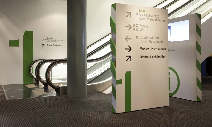
Directional information should help someone make the next choice. A long list can be difficult to scan, especially at a junction where people are moving. Group related destinations where that genuinely helps, and reserve detailed information for places where visitors can pause. The number of messages, their order, and the arrow arrangement should be considered together rather than squeezed into a panel after its dimensions have already been fixed.
Check the meaning of arrows from the actual viewing position. A symbol that looks clear in an artwork file can be confusing when the sign sits beside a staircase, entrance, or offset corridor. Each proposed message should relate to a real route that remains available. Do not use a direction toward a restricted or closed area simply because it appears shorter on the plan. We discuss the information around the site's operational arrangements so the signs support a usable journey rather than an abstract path through the drawing.
Make the information legible and accessible
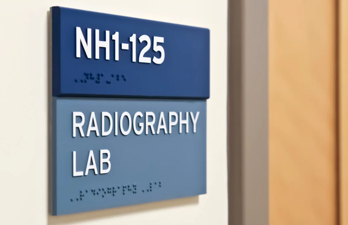
A navigation system should account for people with different visual and mobility needs. Contrast, surface finish, wording, placement, and reading conditions all deserve attention. Applicable accessibility requirements depend on the sign's content and function; directional information and permanent room identification are not governed in exactly the same way. Some categories require visual criteria, while certain identification signs also require tactile content. The exact scope must be reviewed for the project.
Decorative branding should not be assumed to satisfy those requirements. Similarly, a sign described generally as accessible does not establish that the entire route or installation complies. We discuss the proposed functions and recommend the appropriate project review before production. Keep information clear without relying solely on a color cue or a decorative symbol unfamiliar to visitors. Accessibility is part of the real user experience, and it needs coordination with the building and route conditions rather than being treated as a label added to a finished design.
Connect outdoor arrival with indoor navigation
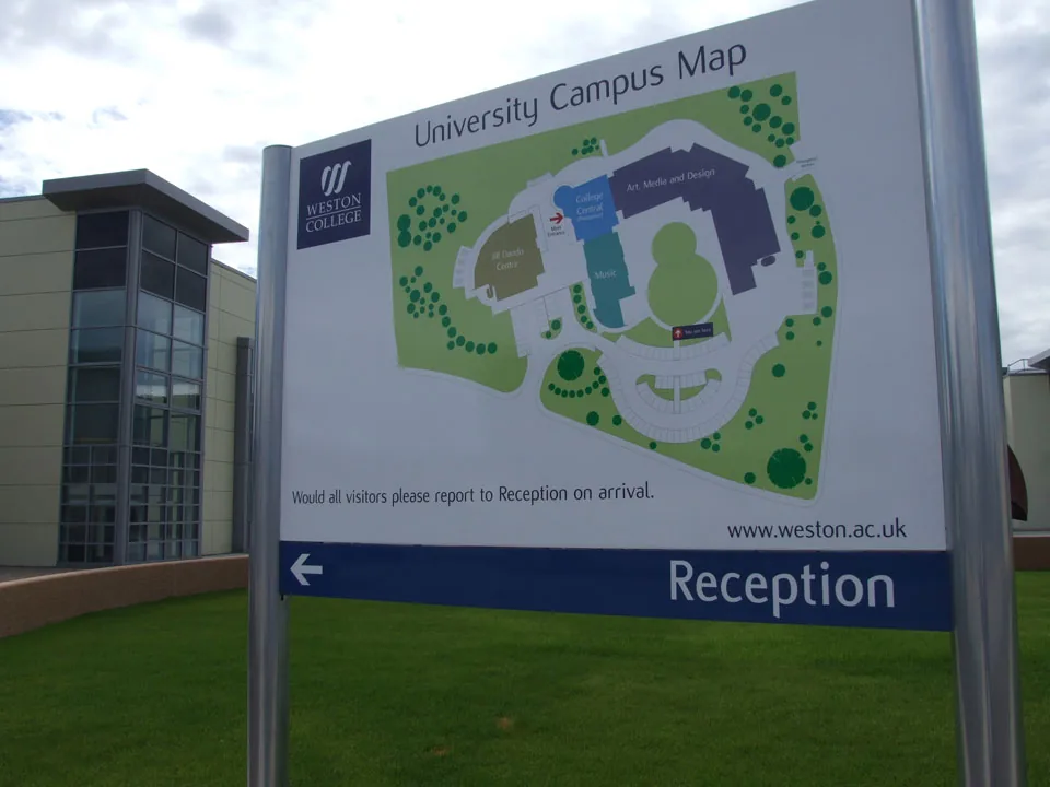
Wayfinding often starts before someone enters the building. The property entrance, parking arrangement, building identification, and visitor door should lead toward the interior system. A clear indoor directory cannot solve confusion about which building to enter. Review the journey as one connected route, including the point where visitors leave their vehicle or approach on foot.
Exterior and interior signs may share a visual family while using constructions suited to their environments. Post and panel signs can provide a physical format for selected outdoor directions where appropriate. Inside, another format may suit corridors and reception areas. The material changes should not interrupt the naming or hierarchy. If a building is marked B outside, the directory should use that same identifier. We help consider those connections so the visitor is not effectively asked to start again each time they cross from the grounds into a lobby or from one building into another.
Choose updateable formats where change is likely
A navigation system can become inaccurate when departments move, entrances change, or tenants are replaced. Identify the information most likely to change before choosing the sign format. Some constructions can use replacement inserts or modular elements, while others require a new face or panel. The update method should be confirmed for the actual product and included in the management plan.
Keep a sign schedule with a location reference, approved wording, dimensions, materials, and artwork version. That record makes future changes easier to coordinate. It also helps prevent an isolated update from introducing a new name or direction that conflicts with the rest of the route. Where changes are phased, review temporary information carefully and remove it when the permanent arrangement is ready. A wayfinding system remains useful only while it reflects the site people are using. The maintenance responsibility therefore includes information accuracy as well as the physical condition of the panels.
Test the proposed journey before and after installation
Before production, review the sign plan against the current layout and agreed visitor routes. Ask someone less familiar with the property to follow the proposed information and note where they hesitate. This is a practical usability review, not a substitute for professional compliance checks. It can reveal missing messages, inconsistent names, or a direction placed at a point where the visitor has already made the wrong choice.
After installation, walk the routes again with the signs in their actual positions. Check views around furniture, doors, landscaping, and other fixtures. Confirm the wording and arrows against the approved schedule. Record any operational changes that were not present during design. We discuss installation around access and use of the premises, with the scope and timing agreed for the project. A complete route review is more useful than inspecting each sign only from directly in front, because visitors encounter the system while moving through the property.
Tell us where visitors lose their way
Send your Houston address, a current site or floor plan, and photographs of the arrival points and confusing areas. Describe the main destinations and the visitors who need to reach them. Include existing signs that are useful as well as those causing problems. Share any planned layout changes, property criteria, and accessibility review arrangements so the brief reflects the actual project rather than an outdated plan.
Royal Signs & Awnings can help develop a wayfinding signage package around those journeys. Request a wayfinding consultation or call (346) 644-6749 to discuss directions, identification, and coordinated navigation. You may need a focused correction at a few decision points or a more complete system across the property. The first step is understanding the uncertainty visitors face. From there, clear naming, appropriate sign roles, readable design, and considered placement can turn a collection of spaces into a route people have a better chance of following independently.
Let’s talk about your sign.
Share your location, artwork and project goals with our Houston team.
Request a ConsultationPROJECT QUESTIONS
Frequently asked questions
What is the difference between directional and identification signs?
Directional signs guide the next decision. Identification signs confirm arrival at a destination. A complete route may require both, using consistent names.
Do I need to replace all existing signs?
Not necessarily. Begin with a route review and identify what remains accurate and useful. A focused update may solve a limited problem, while a larger system may require broader coordination.
Does every wayfinding sign need Braille?
No blanket rule applies to all sign content. Applicable visual and tactile requirements depend on function; permanent room identification differs from directional information. Review the project scope with appropriate expertise.
Can exterior and interior signs form one system?
Yes. The naming and visual hierarchy can remain coordinated while materials and mounting are specified for each environment.
How can we keep navigation signs current?
Maintain a sign schedule and assign responsibility for wording updates. Confirm the replacement process for the selected products and check connected routes whenever a destination moves.