
Explore this page
Royal Signs & Awnings designs, fabricates and installs commercial signs in Houston, including dimensional lettering. If you are considering 3D signage in Houston, the useful questions go beyond how many inches deep a letter should be. Where will people see it? What surface will support it? Does the identity need to work outdoors, indoors or across both settings? What finish will remain appropriate as the surrounding space changes?
Custom dimensional letter signs are often chosen for offices, commercial buildings, retail properties and professional practices. The right design starts with the brand, then accounts for the viewing conditions and construction. Our role is to help translate the approved identity into a sign that can be made and installed for its intended location.
What Makes Dimensional Lettering Different?
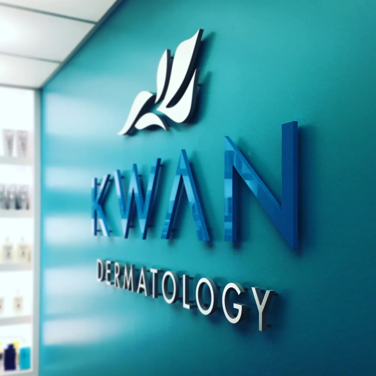
Dimensional lettering describes letters or logo elements with physical depth. The material, thickness and fabrication method determine how that depth is created. Some letters are cut from solid material; others use fabricated construction. The result can be a restrained building identifier, a bold company name or a detailed wall-mounted logo.
The distinction matters when comparing designs and quotes. A shallow cut letter and a larger fabricated letter may reproduce the same name, yet differ in appearance, weight, mounting and cost. A photograph taken directly in front may hide those differences. Side views, samples and construction details help explain what is actually being proposed.
The term 3D sign is also broad. It can refer to commercial dimensional letters, sculptural display work or illuminated lettering. For a business signage project, describe the intended result rather than relying on that label alone. If you want separate illuminated letters for a storefront, a channel-letter sign may be the more appropriate product discussion.
Understanding the sign type early keeps the project focused. It also prevents a visual reference from being interpreted as a request for a construction method that does not suit your wall or budget.
Exterior Dimensional Letters for Commercial Buildings
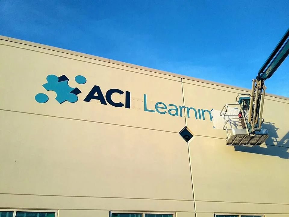
Exterior dimensional letters can identify a business without enclosing its name inside a large sign cabinet. They allow the building surface to become part of the composition. That relationship works best when the color, scale and placement are considered alongside the facade. A dark letter on a dark wall may look refined in a close-up but disappear from farther away. A small wordmark above a broad entrance can feel lost. Conversely, oversized lettering can make an already detailed frontage difficult to read. Site images and accurate measurements help establish a proportion that works in context.
Review the important viewing points: the approach from the road, the parking area and the pedestrian entrance. A sign intended mainly for arriving visitors may need a different layout from one intended to identify the property across a large site. Do not let the dimensions of the logo file become the only guide to the finished size.
For exterior dimensional letters in Houston, the mounting surface and relevant approvals also need attention. Brick, panels, concrete and other finishes present different installation conditions. The selected construction must be assessed against the actual location before production proceeds.
Custom Metal Letters and the Character of the Finish
Metal lettering offers a range of appearances rather than one universal look. Depending on the proposed material and finish, the result may be smooth and painted, visually textured, reflective or more subdued. The choice should connect with the brand and surrounding architecture.
When considering custom metal letters in Houston, look at more than a sample under office lighting. Reflections, adjacent colors and viewing angles can change how a surface appears. A bright finish may catch attention but also reflect a busy background. A painted finish can give more direct control over color, while the fabrication details still influence the edge and depth.
Ask which material and finish the quote includes, how the color will be approved and what maintenance guidance applies. These questions are more useful than assuming every metal sign performs or looks the same. Different constructions can carry different installation requirements, especially for larger letters.
For an existing corporate identity, provide a dependable color reference rather than a screenshot. A clear approval process helps the team agree on the intended appearance before the finished lettering becomes a permanent part of the building.
Acrylic and Other Materials for Interior Identity Signs
An interior logo sign is usually experienced at closer range than an exterior building name. Visitors can see edges, spacing and surface details. That makes clean construction and a considered relationship with the wall particularly important.
Acrylic lettering and other suitable materials can create different effects depending on thickness, color and finish. A reception sign may be designed as individual letters, a grouped logo or elements mounted to a backing panel. The choice depends on the design, wall condition and desired appearance.
Think about the reception area as it will actually be used. Will furniture interrupt the sightline? Does the sign sit behind a desk, near a doorway or beside a display? Is the wall likely to be photographed for meetings or business profiles? Those conditions can affect placement and the amount of visual detail the sign should carry.
Royal Signs & Awnings can discuss commercial logo signs for Houston businesses as part of an interior or exterior project. Bring images of the space and the approved artwork so the material discussion is connected to a real location rather than an isolated product image.
Translating Your Logo Into Fabricated Components
A logo that works on a business card does not always transfer directly into dimensional construction. Very fine lines, small details and closely spaced shapes may need attention. The objective is to preserve the identity while making the proposed sign practical to manufacture and install.
Vector artwork is especially useful because it describes the shapes without relying on a low-resolution image. If the available file is only a photograph or screenshot, the artwork may need to be recreated or clarified before a reliable production drawing can be prepared. Establish who is authorized to approve any adjustments.
Letter spacing should be reviewed as a whole. A word can appear uneven even when individual gaps follow the same measurement, because the shapes create different visual spaces. Logos with several separate elements also need a clear layout so the installer can position them consistently.
Where the same identity will appear on multiple surfaces, consider the relationship between the versions. The exterior sign and reception sign do not have to use identical construction, but they should reproduce the approved name and logo consistently. A shared reference helps prevent small changes from accumulating across locations.
Mounting Options and the Surface Behind the Sign
Mounting is part of the finished appearance. Letters attached close to a wall can feel integrated with the surface. Where appropriate, spacing them away can emphasize depth and create a different shadow. A backing panel can organize a logo and simplify its relationship with a complicated background.
Each option also changes the practical installation discussion. The wall needs to support the selected sign, and the installation method needs to suit both the components and the surface. Existing penetrations, concealed conditions and decorative finishes should be considered before a final approach is chosen.
If the sign is replacing earlier lettering, ask what will remain visible after removal. Old holes, discoloration or patches may sit outside the footprint of the new logo. Whether surface repairs or repainting are included should be stated clearly in the project scope.
An installation layout or template can help organize the work, but it does not replace a site assessment. The aim is to make the approved composition achievable on the real surface, including where the letters align with architectural features or nearby fixtures.
Lighting Choices and When Channel Letters Fit Better
Physical depth and illumination are different design decisions. A dimensional sign can be unlit and still provide a strong identity. If visibility after dark is essential, the project needs a separate lighting discussion.
Existing building lighting may not illuminate the sign effectively. It can cast uneven shadows or leave part of the name in darkness. A proposal should consider how the sign is intended to appear after sunset, rather than assuming daytime readability will carry over automatically.
For a sign that needs individual illuminated letters, review channel-letter options with the team. The appropriate construction depends on the desired appearance, location and electrical provisions. Keep that choice clear in the scope so a request for a 3D logo is not mistaken for a complete illuminated letter system.
Power availability, mounting, access and applicable approvals can influence the final design. Those details should be discussed before fabrication. A night-time photograph of the intended location can be a helpful starting point when the building’s existing lighting is part of the decision.
Comparing Specifications and Planning Future Changes
Two dimensional sign proposals can look similar while describing different work. Compare the letter height, depth, material, finish, logo components, mounting method and installation scope. Check whether artwork preparation and removal of an existing sign are included.
For a growing business, consider how the sign may change. A future name update, office relocation or expansion into another building can affect the value of keeping artwork and finish references organized. Retaining the approved design records makes the next discussion more precise.
Maintenance expectations should also match the location. Ask how the selected components should be cleaned and whether their position allows reasonable access. A sign mounted above an active entrance creates different servicing considerations from one on a reception wall.
The best specification is not necessarily the longest. It is the one that tells everyone what will be made, where it will be installed and what the finished work should look like. That clarity protects the design intent from quotation through installation.
Discuss Your Houston Dimensional Sign Project
Send Royal Signs & Awnings your logo, site photographs, approximate desired dimensions and whether the sign will be indoors or outdoors. Tell us who needs to see it and from where. If you have a finish reference or landlord criteria, include those as well.
We can discuss materials, construction and installation for your commercial identity sign. Request a project quote through our contact page to begin turning your artwork into a dimensional sign designed for the actual space.
Let’s talk about your sign.
Share your location, artwork and project goals with our Houston team.
Request a Project QuotePROJECT QUESTIONS
Dimensional Letter and 3D Sign FAQs
Are dimensional letters the same as channel letters?
The terms overlap in appearance, but they describe different product discussions. Dimensional letters have physical depth and may be unlit. Channel letters use fabricated letter construction and are often illuminated. Specify whether you need lighting so the correct sign type can be proposed.
Can dimensional letters be installed outside?
Yes, suitable dimensional lettering can be designed for exterior locations. Material, finish, mounting surface and installation conditions need to be assessed for the project. An interior sign specification should not automatically be reused outdoors.
Which material is best for a commercial logo sign?
There is no single best material for every logo. The design, location, size, desired finish and mounting requirements influence the recommendation. Comparing samples and construction details will help you choose a suitable option for your business.
Can you work from our existing logo?
Yes. Supply the approved artwork, preferably in vector format, along with any brand guidelines. Fine details or small elements may require a fabrication review. Any proposed artwork adjustments should be approved by your designated representative before production.
Will replacing our old letters leave marks on the wall?
It can. Existing holes, surface discoloration or older mounting components may become visible when the previous sign is removed. Discuss removal and any surface restoration separately so the installation scope is clear.
What affects the cost of dimensional lettering?
Letter and logo size, depth, material, finish, artwork preparation, mounting and installation access all affect the quote. Lighting or removal work can add further scope. Share the site and artwork details for a project-specific estimate.